Luxury Brand Logo Evolution: Past to Present Journey

Luxury Brand Logo Evolution Past to Present Journey
Timeless Classic or Modern Minimalist? Today, Luxe addict takes you on an exclusive look at the evolution of iconic luxury logos. These visual transformations reflect the changing eras and the shifting creative directions of each maison. Whether it's a complete High-end Brand Rebranding to mirror a new identity or a subtle tweak to create a more contemporary image, these Fashion Brand Logo Changes significantly impact a brand’s global prestige. Let's explore the storied history behind these legendary symbols.
Sometimes, these shifts aren't just about the logo itself but are launched alongside trend-setting campaigns. A prime example is how these elite houses are currently mastering seasonal palettes discover more in our feature: How Luxury Brands Style "Cloud Dancer" Tones to Achieve "Quiet Luxury" Elegance.
![]()
Luxury Logo History When Heritage Meets Contemporary Design
A Brand Identity Transformation often occurs when a new Creative Director takes the lead or when a brand pivots its vision. Notable examples include
-
Bottega Veneta: From its founding in the 1960s with a thin Serif font, the logo evolved into a bolder, more stable look between 1966 and 2018. Since 2018, it has adopted a cleaner, more modern typeface that feels fresh yet established.
-
CELINE: A fascinating case in Minimalist Luxury Logos. During the Phoebe Philo era (2012–2018), the brand used "CÉLINE" with an accent. In 2018, Hedi Slimane removed the accent and tightened the letter spacing, reflecting a modern-vintage aesthetic inspired by the 1960s.
-
Saint Laurent: The legendary "YSL" monogram designed by Cassandre in 1962 was replaced by "SAINT LAURENT PARIS" in 2012 by Hedi Slimane, opting for a sleek, minimalist look. However, by 2023, the brand began reintroducing elegant, curved fonts to communicate its heritage once again.
![]()
Comparing Luxury Logos The Shift Toward Powerful Simplicity
Modern High-end Brand Rebranding often leans toward minimalism, ensuring logos are highly legible and functional for digital platforms.
-
Dior: After decades of using the lowercase "Dior" logo (since 1948), the house shifted to an all-caps "DIOR" in 2018 to project strength. More recently, in 2025, under Jonathan Anderson, the brand introduced a "New Old Dior" font, blending historical prestige with a modern edge.
-
Balenciaga: Reflecting a futuristic vision, the brand moved away from its interlocking "B" symbol to a bold, thick Sans-serif font in 2017. This change, led by Demna Gvasalia, signifies a universal and powerful simplicity.
Rebranding for a New Identity Which Era Do You Love
Whether it’s Gucci transforming from a 1958 family crest to the iconic 1992 Double G, and finally to today’s wide-spaced, all-caps font every change is rooted in reaching a new generation of clients.
For the luxury community, which speaks to you more: the "Old Heritage" feel that exudes history and prestige, or the "New Minimalist" style that feels sleek and current? Which brand's rebranding journey was your favorite? Or is there a classic logo you truly miss? Feel free to share your thoughts with us
![]()
The Luxury Brand Logo Evolution is a mirror reflecting how houses adapt to the times. While designs may change, the core values and luxury essence passed through these symbols remain constant for decades.
Recommended for You
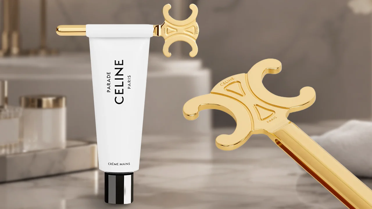
CELINE Toothpaste Squeezer Price & Review: Luxury Item
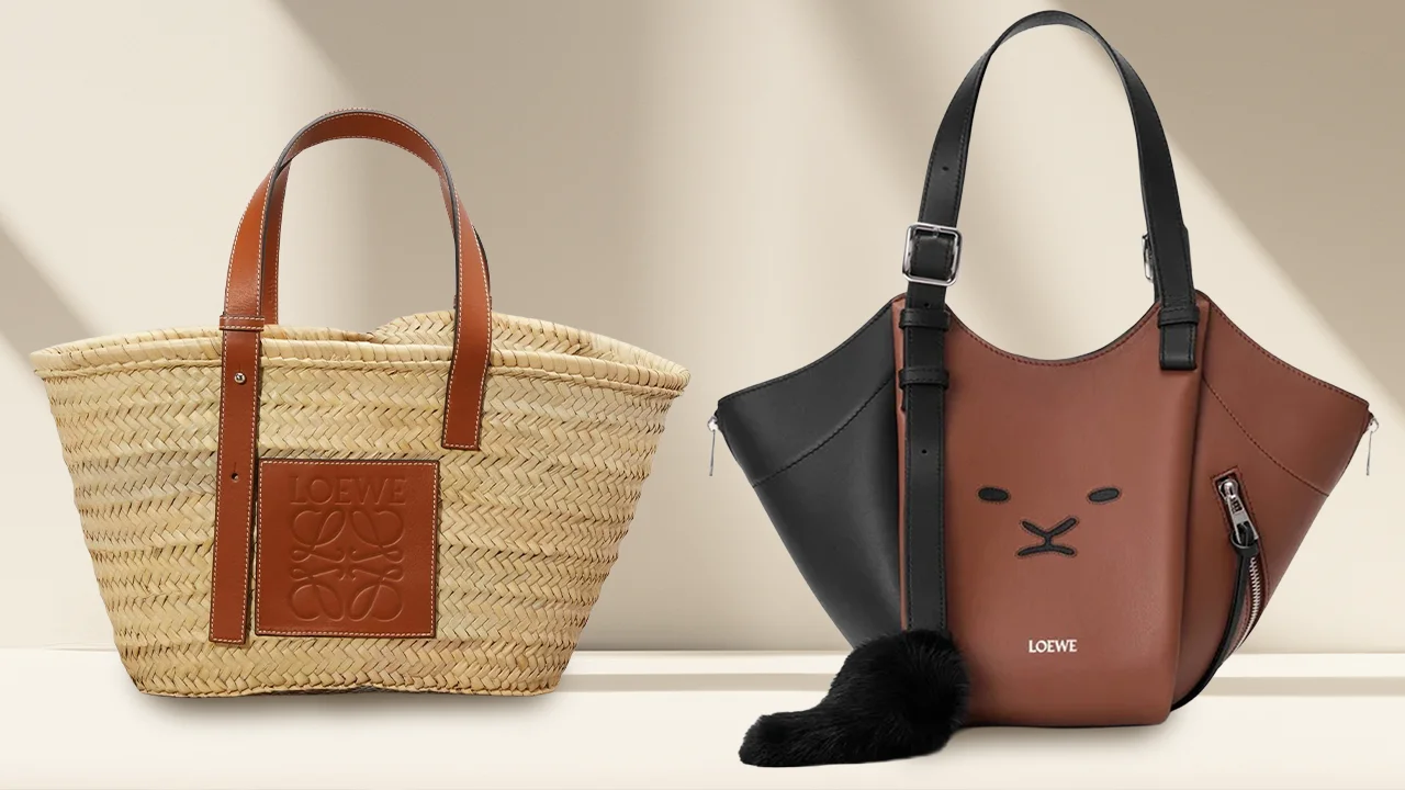
LOEWE Iconic Bags History Guide: 180 Years Heritage
Luxury Brands Without Shops in Thailand: Shopping Guide

💬 Comments
0✍️ Add a Comment